Color is a sacrament of experience. An expatiate of shimmers. Maybe you're absent-mindedly watching how the sun lifts its head. Maybe you step outside wherever you are when you read this and find yourself surprised at the way in which fantastical peels of burnt cosmic orange make themselves known as the sun sets. Maybe you've just gone from Paris to Shoreditch in London and find yourself experiencing gentle color whiplash, the black, white, beige, and grays of the City of Lights being traded for a borough where it feels — for a fleetingly strange, uncanny, 'I can't believe it' moment — like 1968 never left. Maybe you're the Catalan painter Antonio Lopez Garcia and find yourself spending time on celluloid watching all the different ways light can strike a quince tree. All of which is to say: there is something about the way color functions as a silent partner in our lives, and there was no one more interested in color's unarticulated role in our lives than Kip.
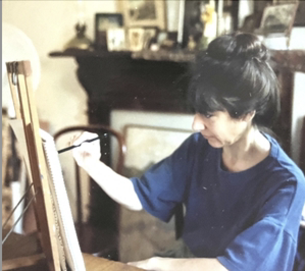
Kippi Kostoulakos Fleischer (hereafter referred to in these notes as Kip) would be mortified by the fact that you are here, not just for the cosmic inconvenience that has been put upon her, but also by the fact that you are looking at this art at all. Why run the risk of showing art — of performing — when art is a way of living? Why degrade living with something as tacky as performance? When a comic gets a laugh, they succeed. When a musician finishes a song, we applaud.
But a painter? A painter in America in the twentieth and twenty-first century? The writer and critic John Berger has an essay in his book Permanent Red called "The Difficulty of Being An Artist," where he made the case that artists working in the 1950's 'lacked a vision for the future' and so resorted to strategies of "trivial opportunism" and that it is "the triviality of so many contemporary works … that makes them so irrelevant to the modern world."
Thirty years later, there were forces producing art that the art critic Robert Hughes called "the same menu touristique" in The Spectacle of Skill.
Trivial opportunism. The same menu touristique. These are the forces that painters have been dealing with for at least the past seventy years.
But an artist is not a market force. A real artist lives. Your art is synonymous with your living. It's normal. You wake up, make coffee for yourself and your family before they wake up, and you head out to the studio to paint. Maybe you put some music on. Maybe you don't.
And then you look. You look at what you've done. You look at the light in the room. You look at the paint. You look at the geometry of shapes. You look at the colors. You look and you look and you get back to work.
By offering this catalog/website as a guide rail, something to hold onto, we are not saying that this is how the art should be read; that it is this and only this, nor are we saying that 'everyone gets to have their own opinion, and that every opinion is right' — we're not. Exegesis can speak to art but it isn't art itself. Art is widely, wildly democratic, but there is still right and wrong.
This is not intended to be a comprehensive show, nor is it intended to be a comprehensive catalog essay, nor a comprehensive website. What has been chosen has been chosen at the level of intuition, and it's been chosen with rooms of the house in mind. As such, this essay will serve as a guide to the rooms of the house in which these artworks are being shown. There are four rooms where Kip's art is being shown; as such, this essay will have four sections.
the hallway
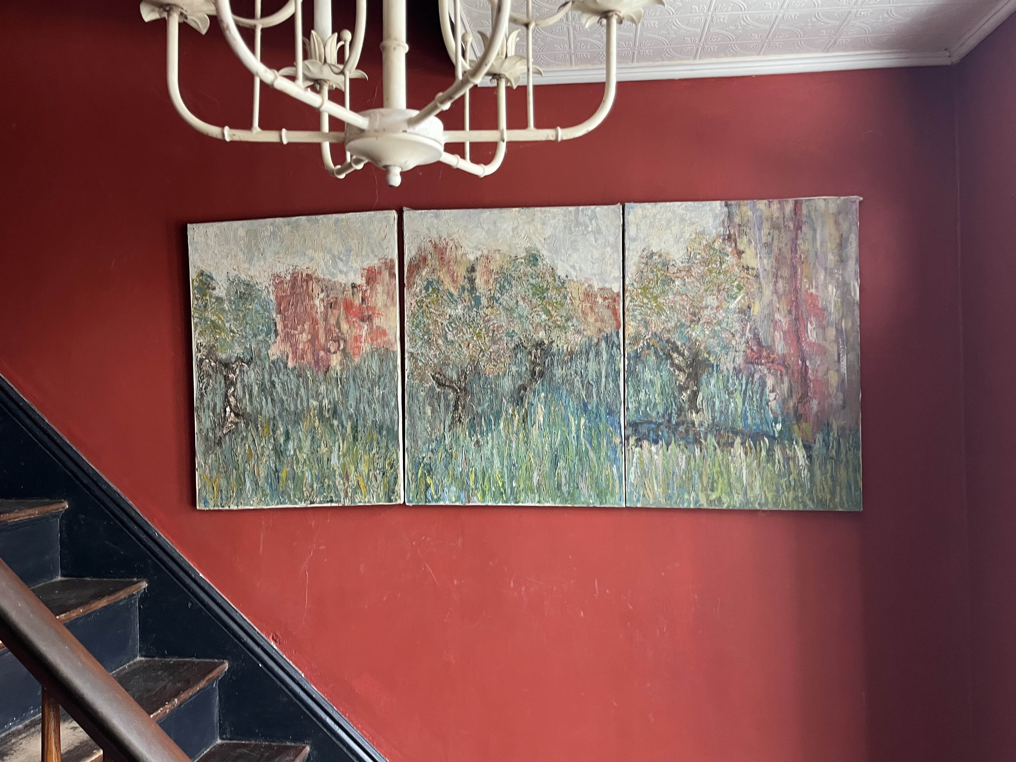
To your immediate right as you enter the house is Kip's first triptych. It's a landscape heavy with impasto, as if a Monet was dropped underwater and then opened his eyes. High grasses lined by a perimeter of trees are the ostensible subject of what we perceive.
Triptychs are known for being the form through which devotional art expresses itself. The Garden of Earthly Delights by Bosch is a famous example of a triptych — that, and his Haywain Triptych.
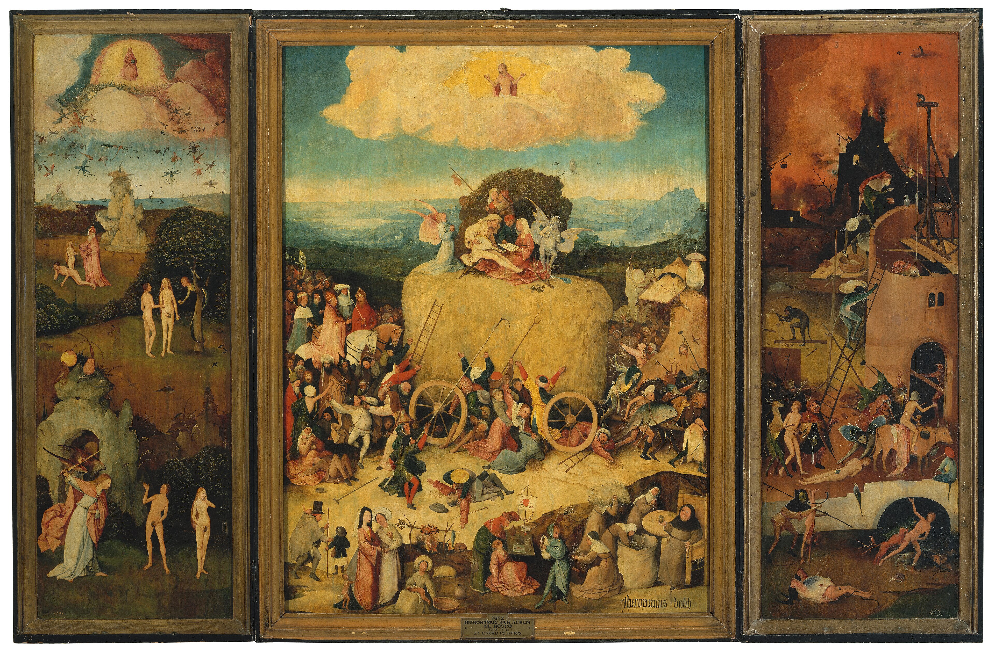
It is worth asking ourselves what a 'traditional' triptych does and what Kip is doing differently with this (which will perhaps lead us to the 'why.')
A 'traditional' triptych tells a story of religious devotion. It often prioritizes the center panel. It invites us into a space where we can compare and contrast what we see in one panel as opposed to the other. It is of a size that is intentionally created to overwhelm your eye. An altarpiece triptych can be opened and closed, and so acts as something of a threshold. (Bear this in mind as you later look at Kip's depictions of iconostasis.)
Here, with Kip's triptych, we see instead a dissolution of hierarchy, an interest in holistic vision, as well as an interest in prioritizing experience over narrative, all of which sits in stark contrast to the triptych's religious expectation of form.
The expected subject of our devotion has changed. So what happens to the subject of our devotion when it is instead something wild, something that resists fragmentation, resists story, and can't be named? What happens when the form of the triptych is turned against itself?
the living room
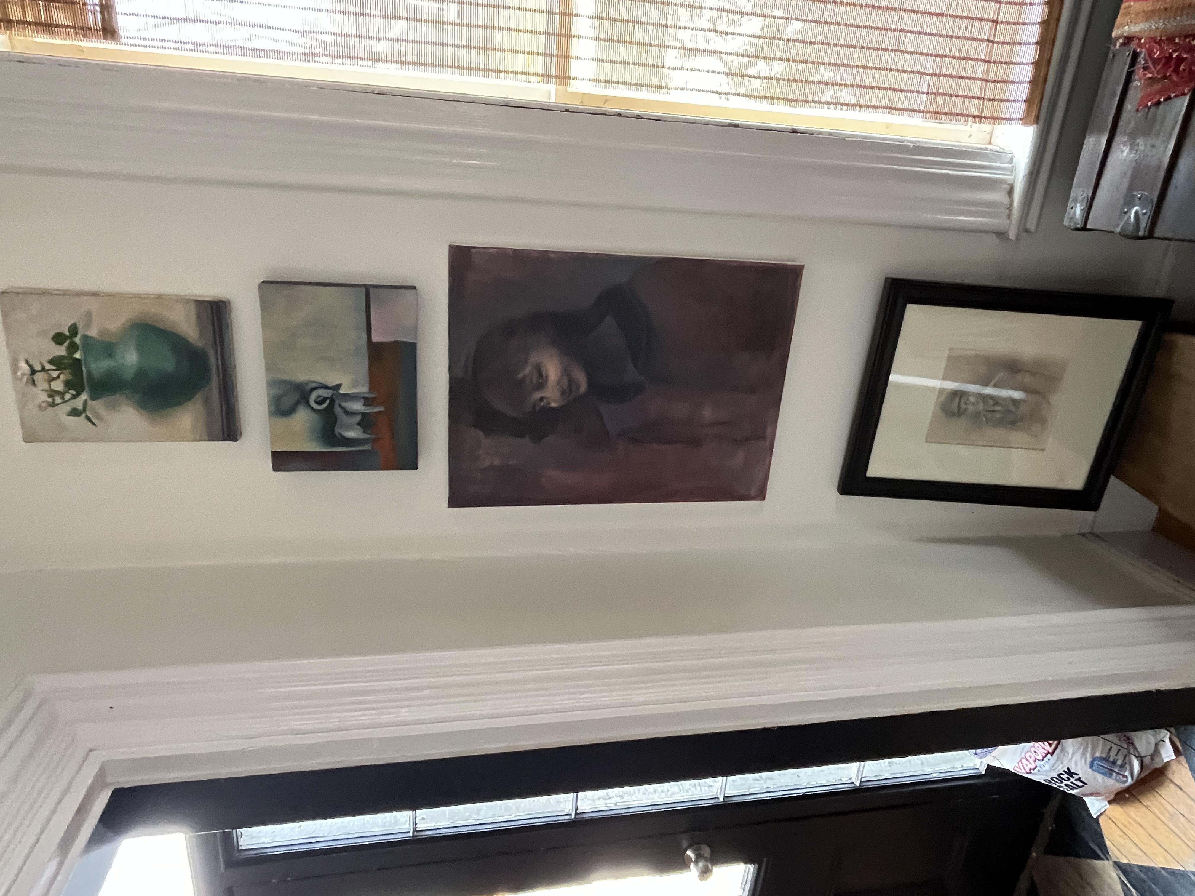
Immediately after the hallway — as you enter the living room — we find a column of four works of art. In descending order, they are: a still life of a vase filled with flowers, a still life of a ram in the style of Morandi (painted circa 1980), a portrait of her niece, Caroline Easton, and a pencil drawing of her father, George Kostoulakos.
With the drawing of her father, we can see craft — that is to say: an understanding of figure drawing. Paired with the three pictures above, we get a brief introduction to some of Kip's range: figurative composition, character studies, a keen awareness of moments in artistic time, who occupied those moments, and how (the Dutch painted flowers this way, Morandi tackled still lifes this way, Picasso approached his blue period this way.) Berger once said that drawing was discovery for an artist, and so we say that living within certain histories of art was discovery for Kip.
We turn from the corner of four works of art and look upon the living room as a whole.
There are several things in the living room. There are art books, couches, chairs, lamps, and a long table picked up from a private high school. On the side of one of the bookshelves are pencil markings keeping track of Evan's height as he grew over the years.
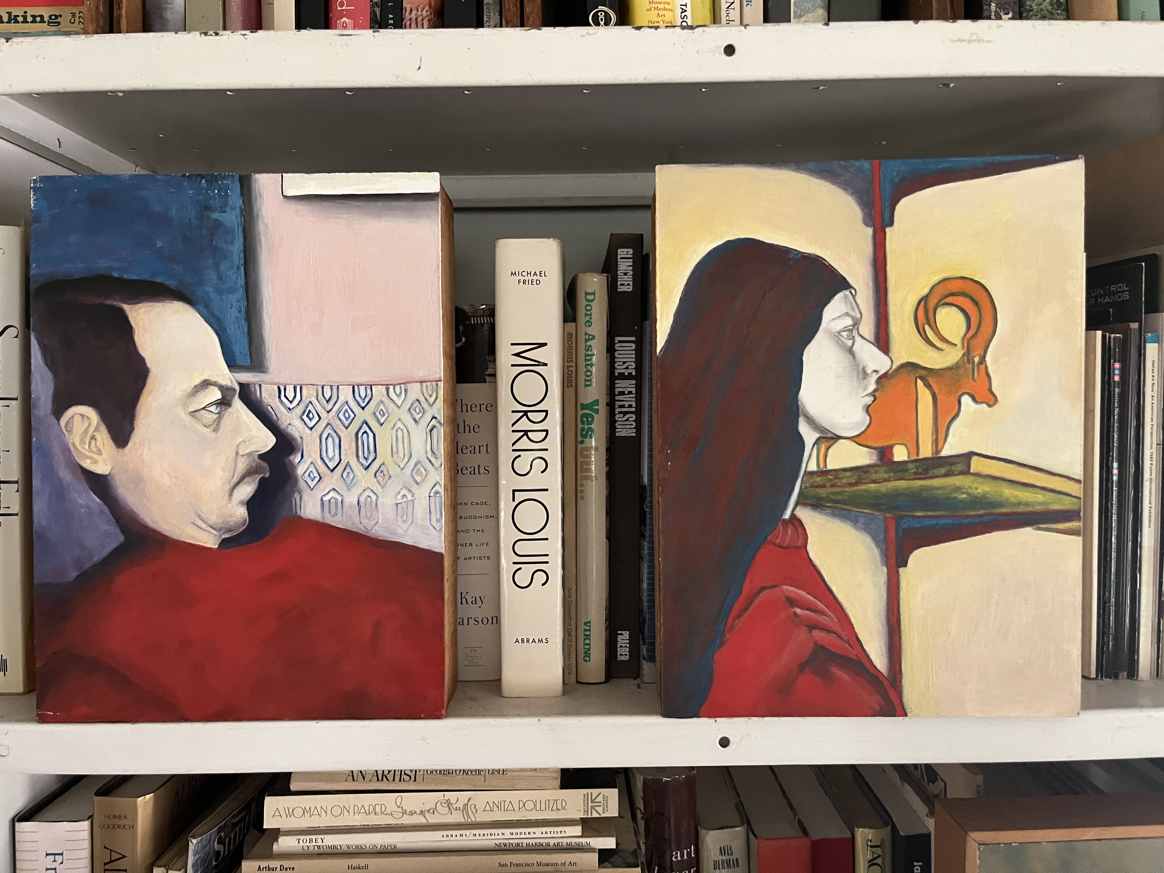
On the bookshelves themselves are a mixture of portraits of Kip, her husband, Richard, and their friends in California and either abstract colors or still lifes of certain objects.
The portraits are rendered in profile. The profiles are uniform. The color is both bright and pallid. The color does not seem to capture or overwhelm the painting; if anything, the color on display here is one of sharp control.
And what are we to make of the subject's focus, particularly the focus when paired with the self-assertion of color? We are observing these individuals, perhaps without their knowledge. Our gaze does not meet theirs. The color insists we look. The contradictions begin to feel intentional.
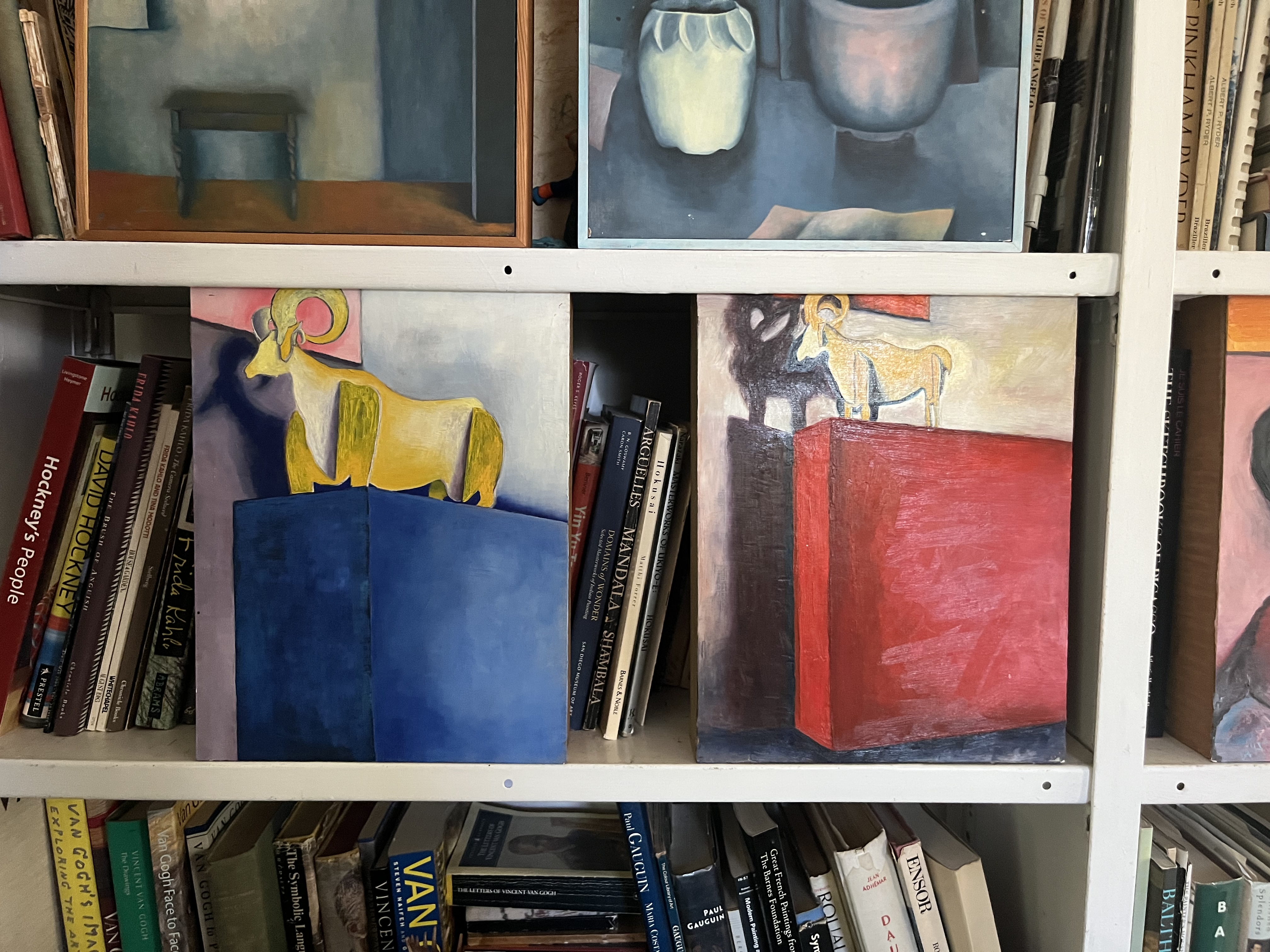
Also of note is a fairly direct reply to/inversion of Giorgio Morandi. Morandi was known for still lifes that seemed to drain of color the longer you looked at them. With Kip, though, we have a yellow ram atop a bursting blue. We have the same ram atop a commanding red. Here are colors that — the longer you look — remain themselves. They persist in an oddly elemental way. And as they persist, we wonder about the shadow and the light source. Who or what is responsible for the light?
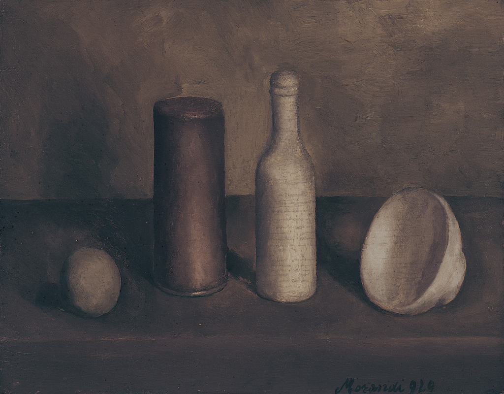
Just as Kip transformed a triptych, so, too, has she found something within the world of Morandi — in this case, a struck chord of color.
And what do we do with this color, you might ask? How do we unpack the idea of color being 'a sacrament of experience?'
Maybe one answer is: one step at a time. Maybe we look at color and ask ourselves, "How do you want to live with it?"
This is why the writer of this catalogue wishes he had spoken with her more about the Spanish filmmaker Pedro Almodovar. Both Kip and the writer of the catalog liked Almodovar, spoke about him plenty, but the writer is listening to the rain wondering about conversations of color. Chords of color. How the song is played.
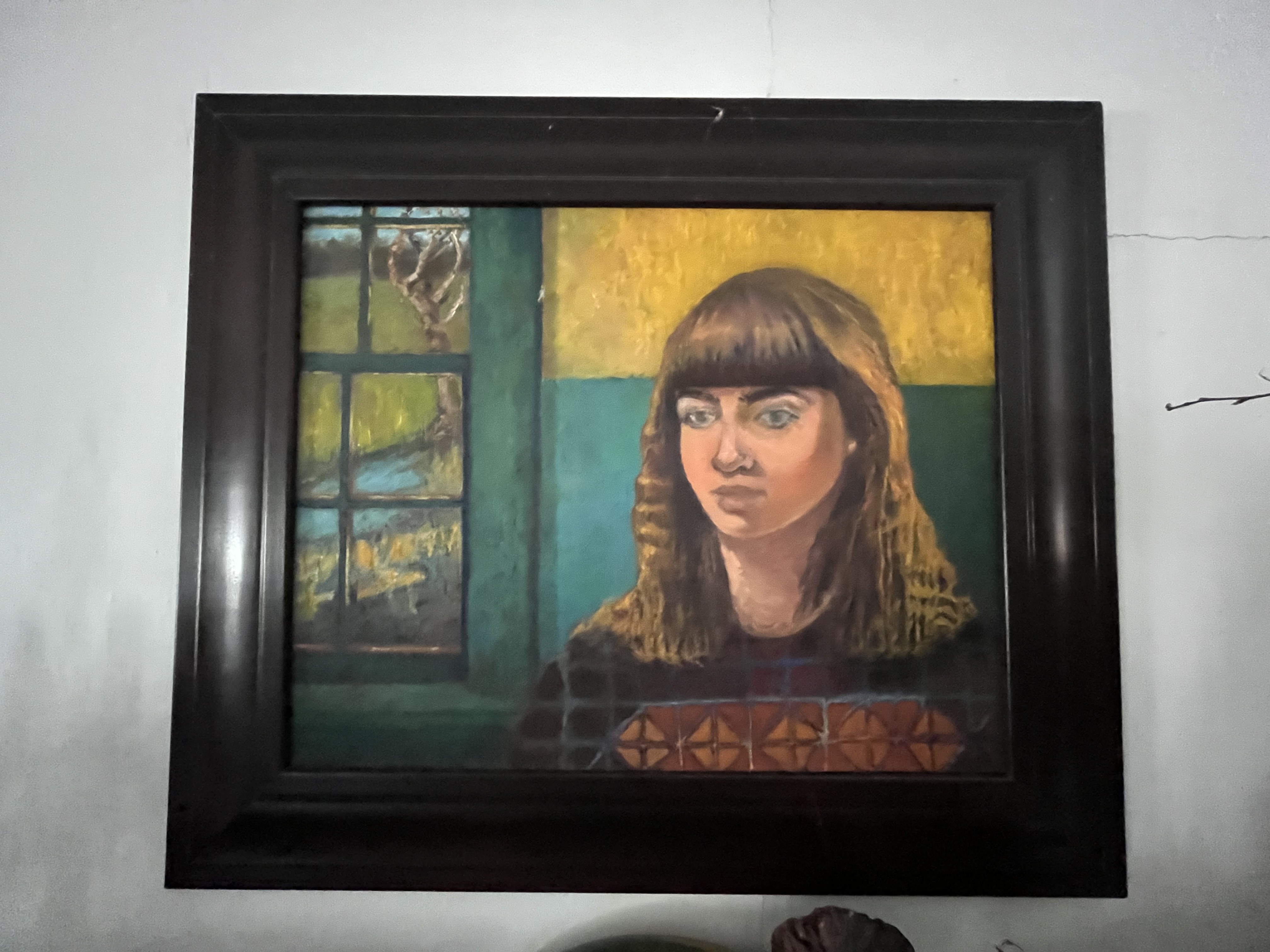
Facing the bookshelves is another portrait of Caroline Easton. Though obscured by several items on the mantelpiece — vases, Christmas ornaments, an unlit lamp, and more — we can still see the literal geometric texture at the bottom of the work, as if Caroline was an old Russian icon; we see the landscape through the window that sits as fresh and free as something painted by Jean-Baptiste-Camille Corot; and we see the colors, the yellow of which sits like a square halo and the blue that sits on the opposite end of the color wheel, underlining the intensity of the subject — because, as Kip once more or less said, art is devotion.

On April 9th, 1976, Kip wrote a paper on iconostasis. In her words —
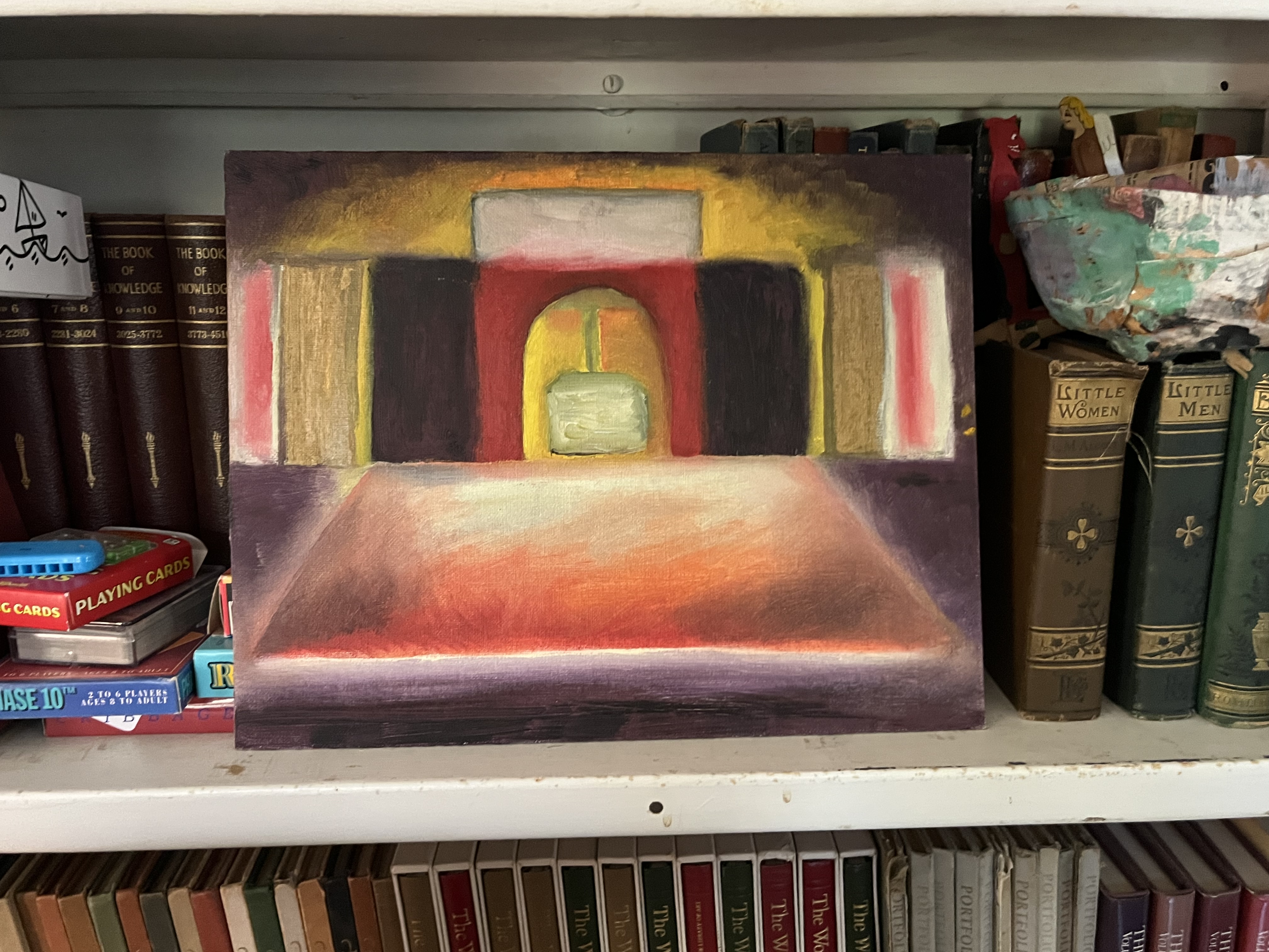
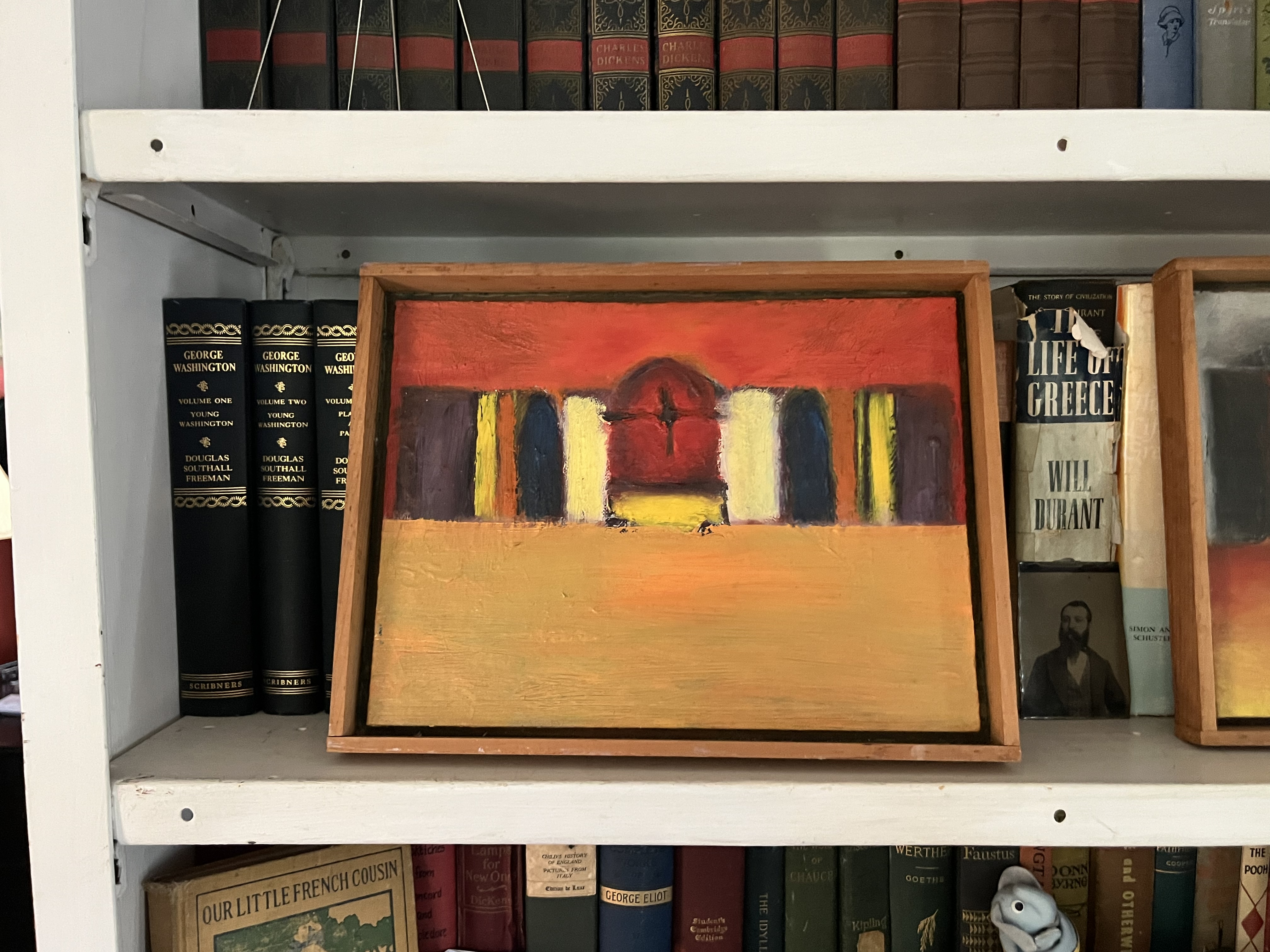
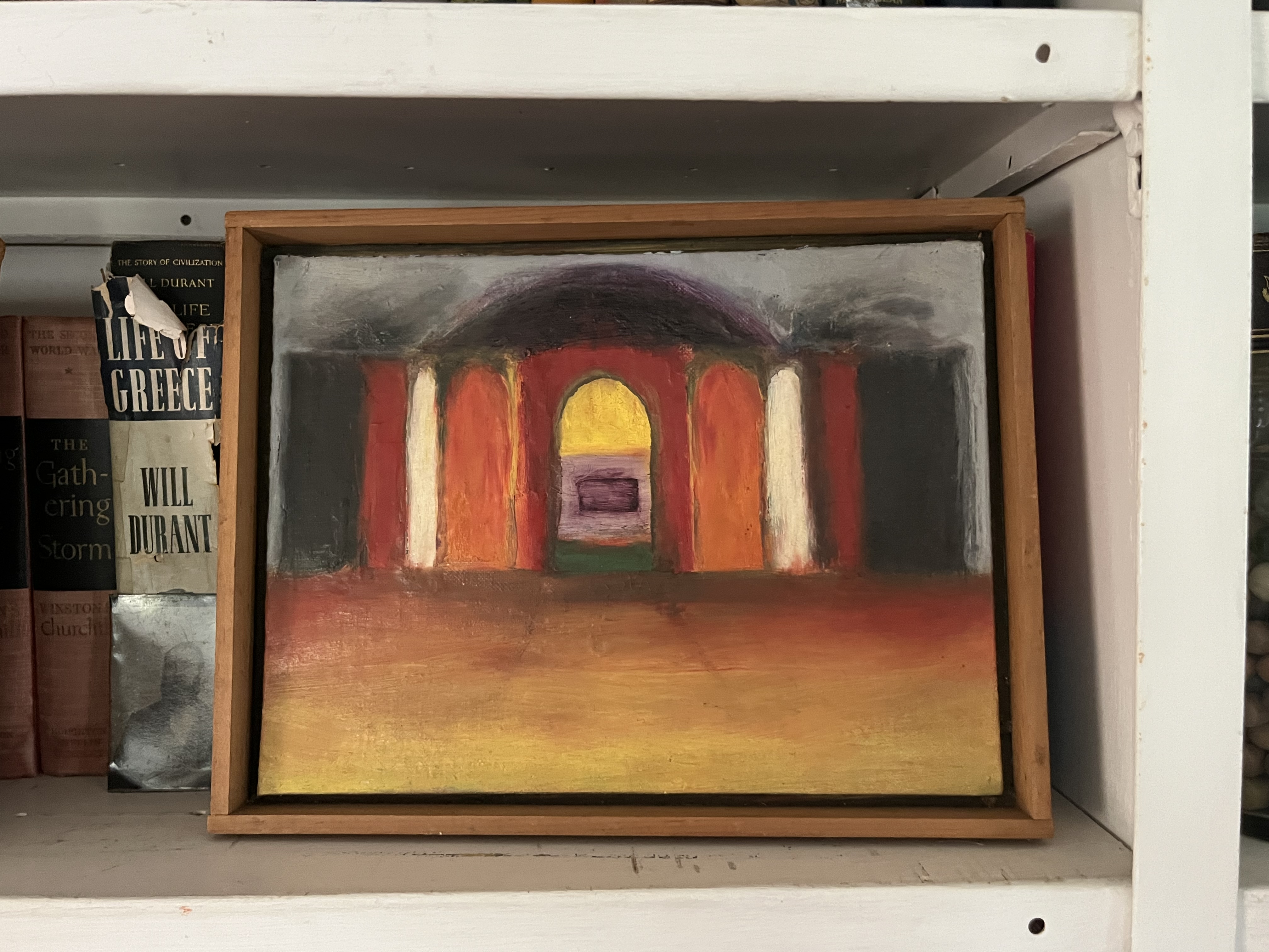
And once we recognize these paintings as abstract, color-heavy depictions of iconostasis (and why these colors in this way?), we then notice the clear invocation of an iconostasis in her depiction of her grandfather the candlemaker.
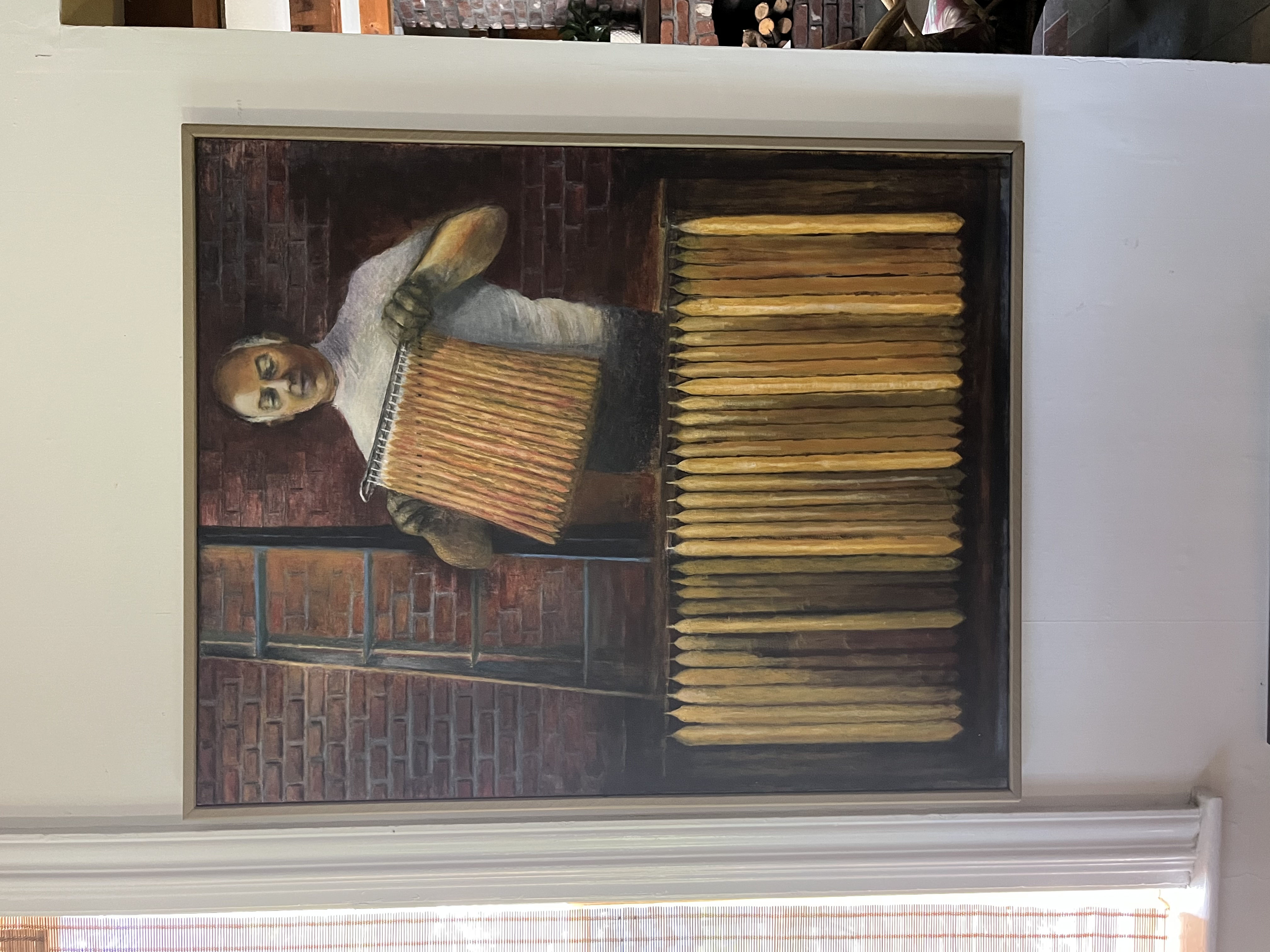
Right before we leave the living room and enter the kitchen is a portrait of Kip's Uncle, Nick "Nicky" Dristilaris. The Ymitos Candle Factory in Lowell, MA in 1910 and it stayed within control of the Dristilaris family until 1990. The Candle Factory is perhaps best known for providing the candles for Steven Spielberg's Lincoln. We note the yellow skin of George matching the yellow of the candles.
Though perhaps 'yellow' isn't a fair description of the color we see, what, with an artist output so particular about color. Perhaps we can say, 'Gold.' Perhaps we can say, 'Amber.' Perhaps we can look at the image as a whole and note that light is made by someone's hand.
We note a poem Kip wrote for an art show at the Santa Ana College Art Gallery in 1983 called "Feast for the Beast," the opening lines of which read, "Zeus is staring at me from behind that wall / making sure I honor his dear ones." We note the way the candles resemble an iconostasis once again — and perhaps this is why we see the candles arranged in the way that they are and why we have a ladder leading up into light just beyond.
Earlier in the essay, we asked, 'Who or what is responsible for the light?' Here, in this painting, we have a literal answer — this person, so much so that he looks like a candle himself.
In taking it all in, we note the emerging themes of iconostasis, family, devotion, and color.
the kitchen
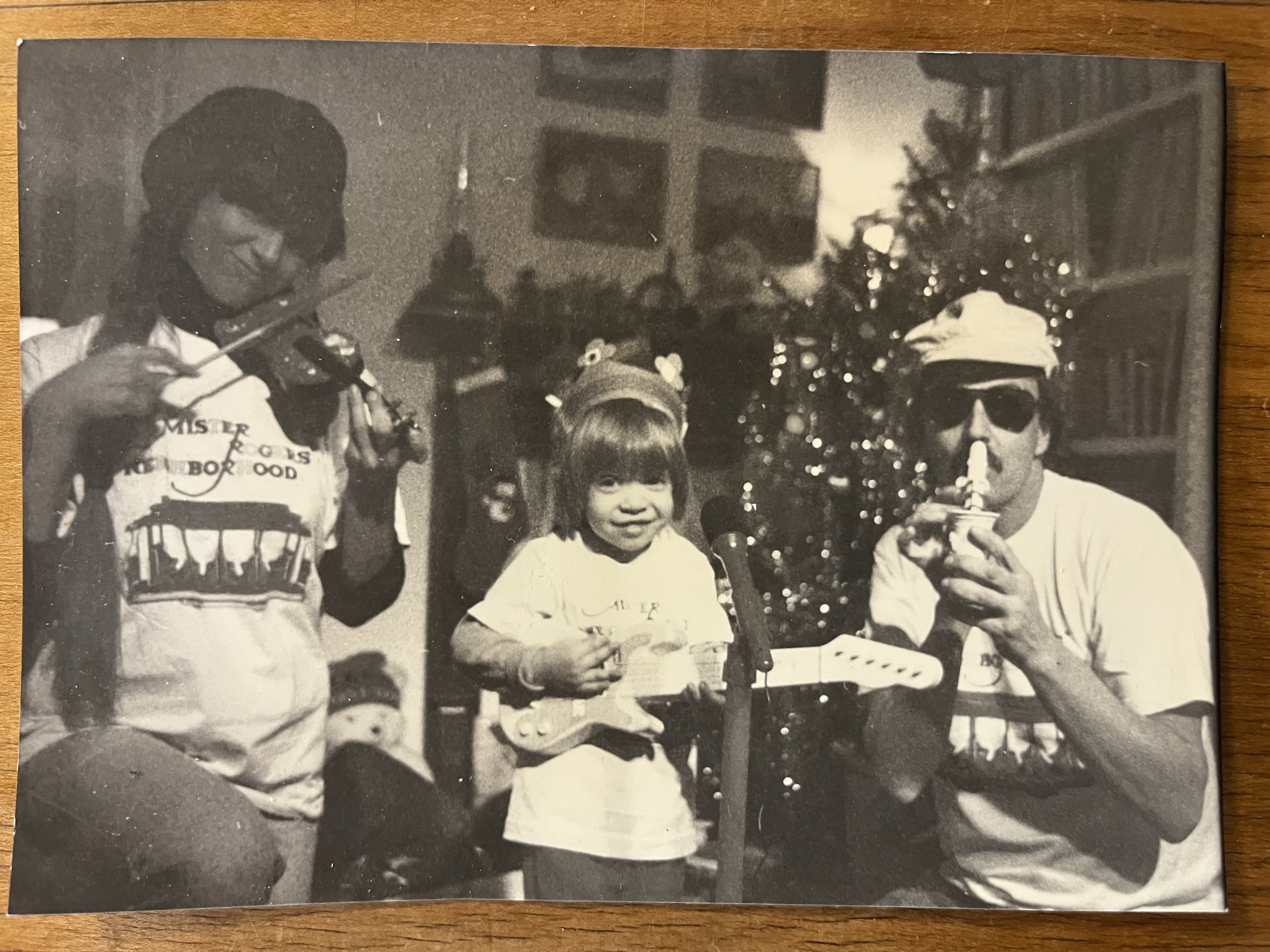
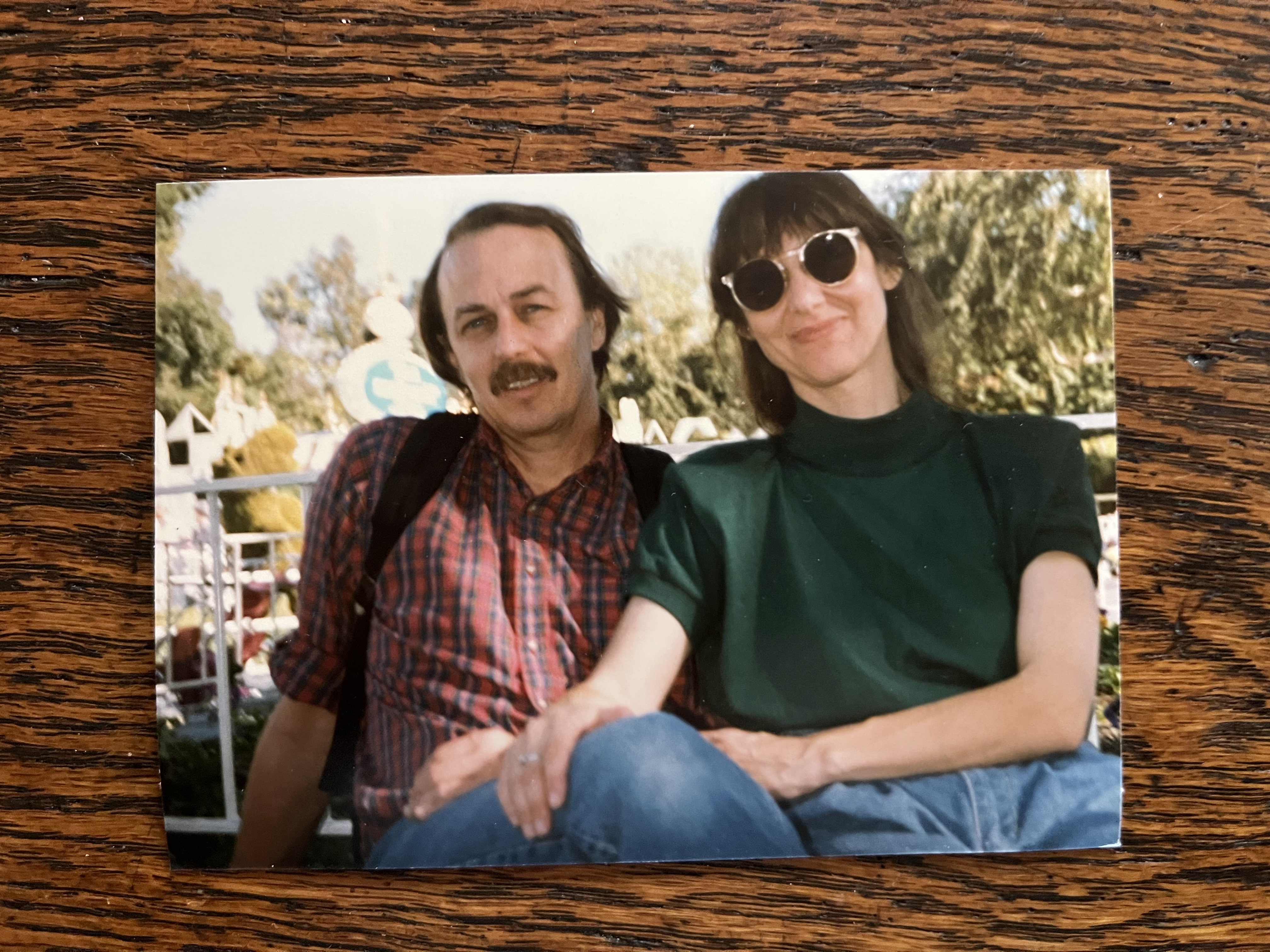
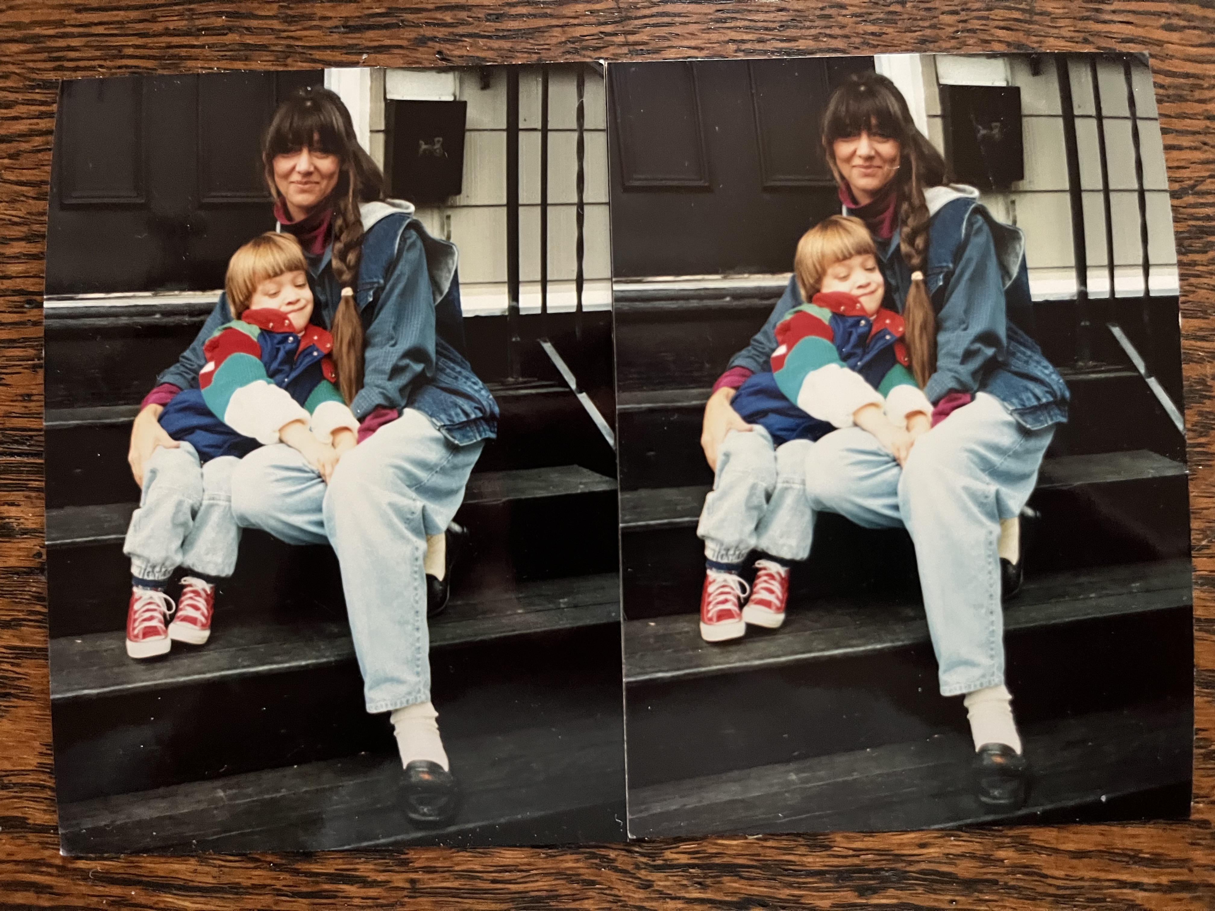
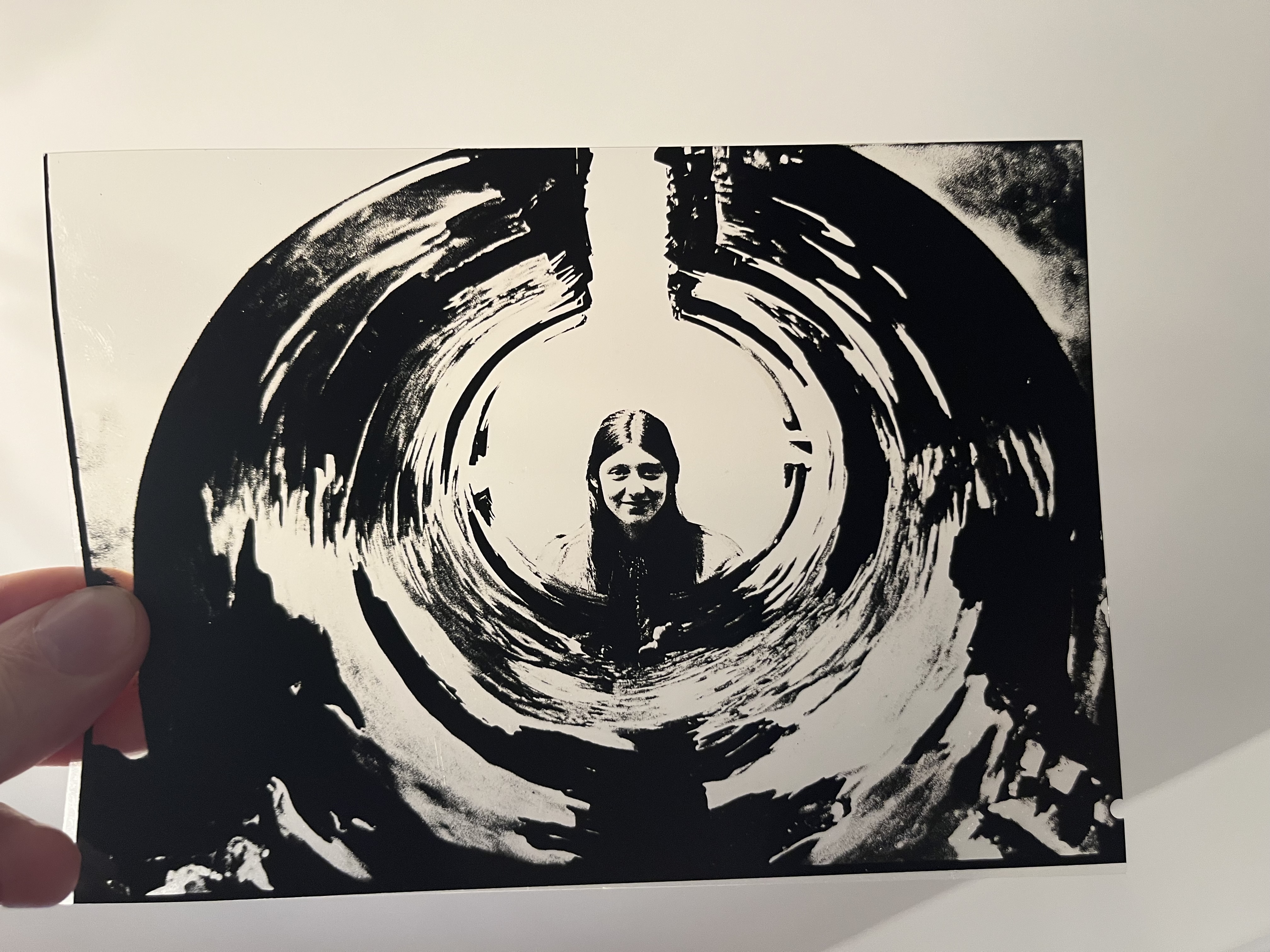
The kitchen — represented by the above photos — is a gesture to what couldn't be included in the show. It's a gesture to the fact that you're walking through someone's home and looking at someone's art. We would place food here, offer you drinks and snacks, but in order to encourage people to move through the house, we've placed food and drink outside the studio.
the studio
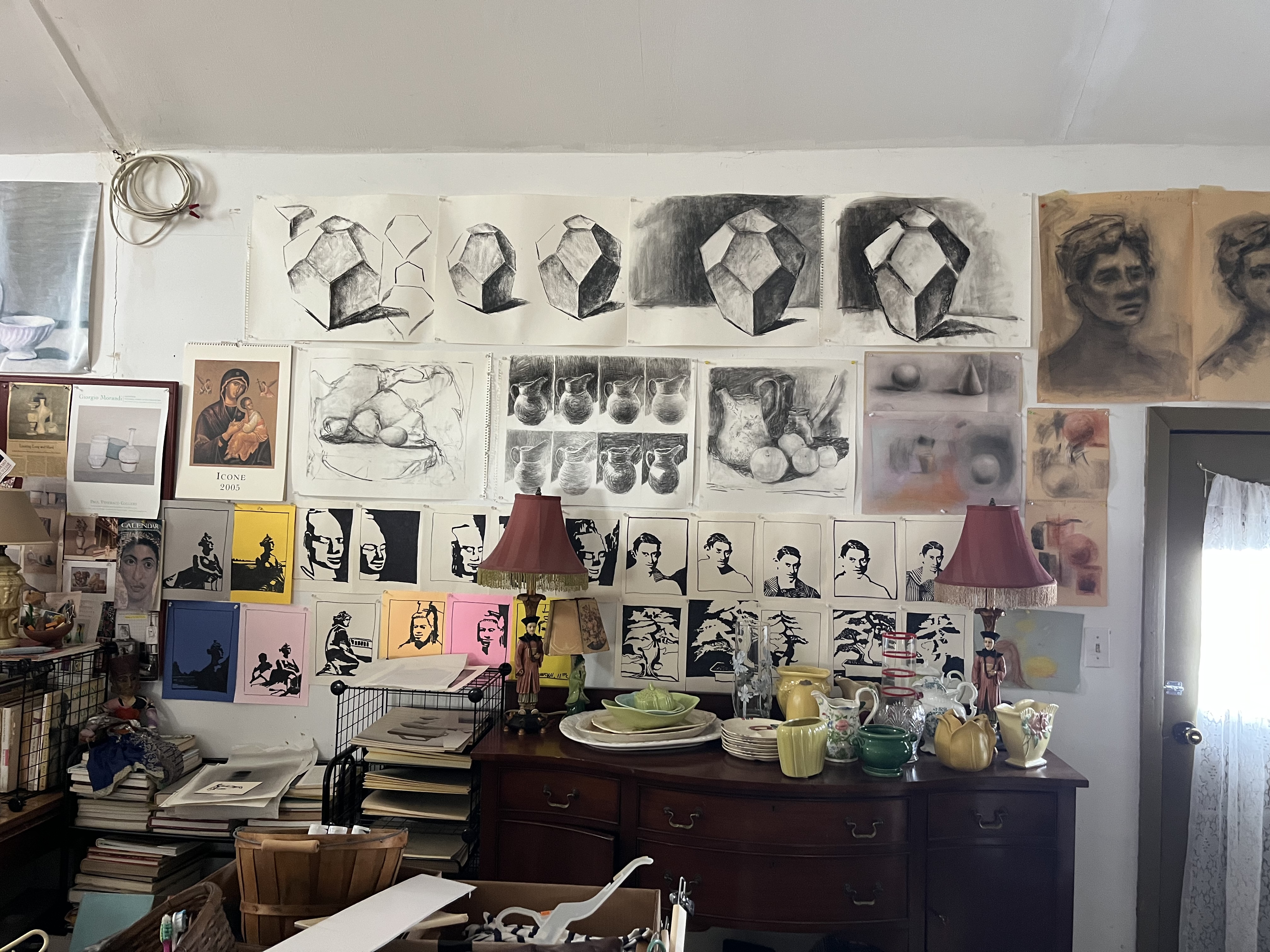
The art studio is a confetti cannon of density. It's the comfort of an excess of associations. It's studies of faces and shapes hanging on the wall amidst posters from various art shows and exhibitions that have taken place over the world over the years, most of which Kip saw in person. It's where you'd wander in the morning to say, 'Good morning' and hear Andres Segovia or medieval choral music and Kip's voice greet you back.
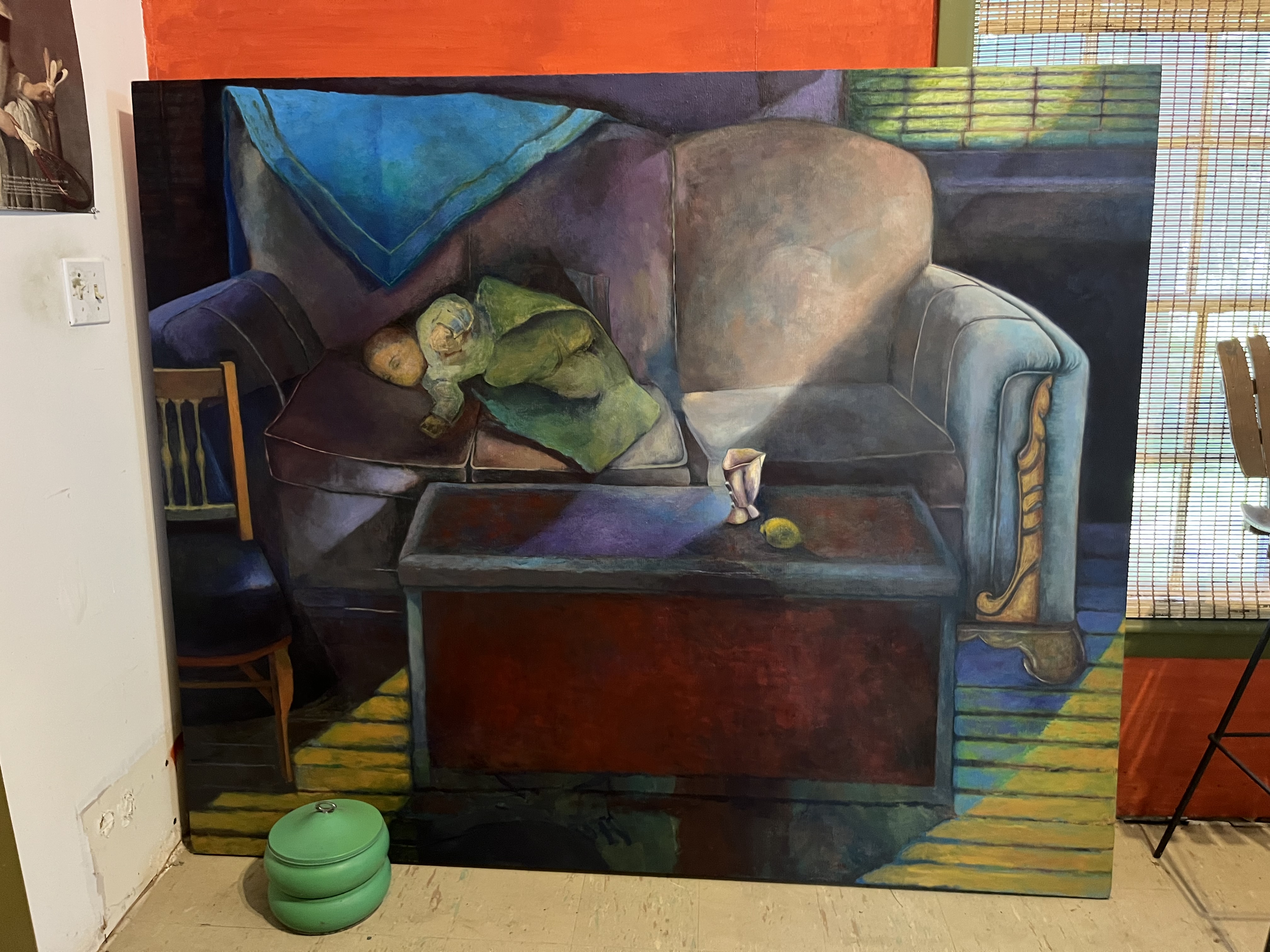
There are several works here in the studio worth acknowledging, such that it risks breaking the overall form of coherence of this brief catalogue essay. For instance: are we really going to move past the huge canvas of Evan as an infant swaddled on a couch, a work which took her well over a decade to finish?
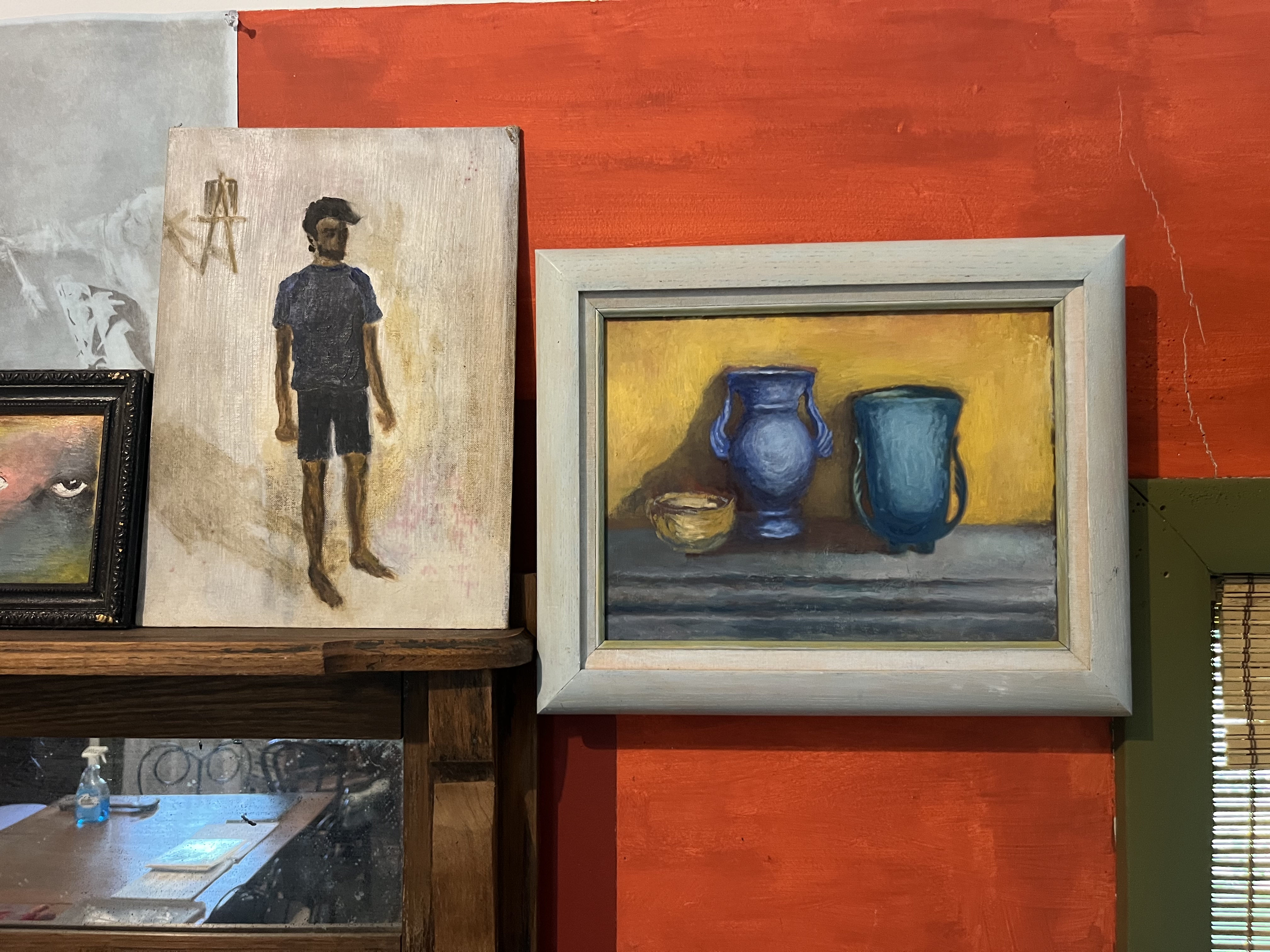
Or what about a piece Kip made as a teenager that ended up looking exactly how her son would later look as a teenager? A fact she was happy to tell him about, bringing him into the studio after having re-discovered the painting after years and years.
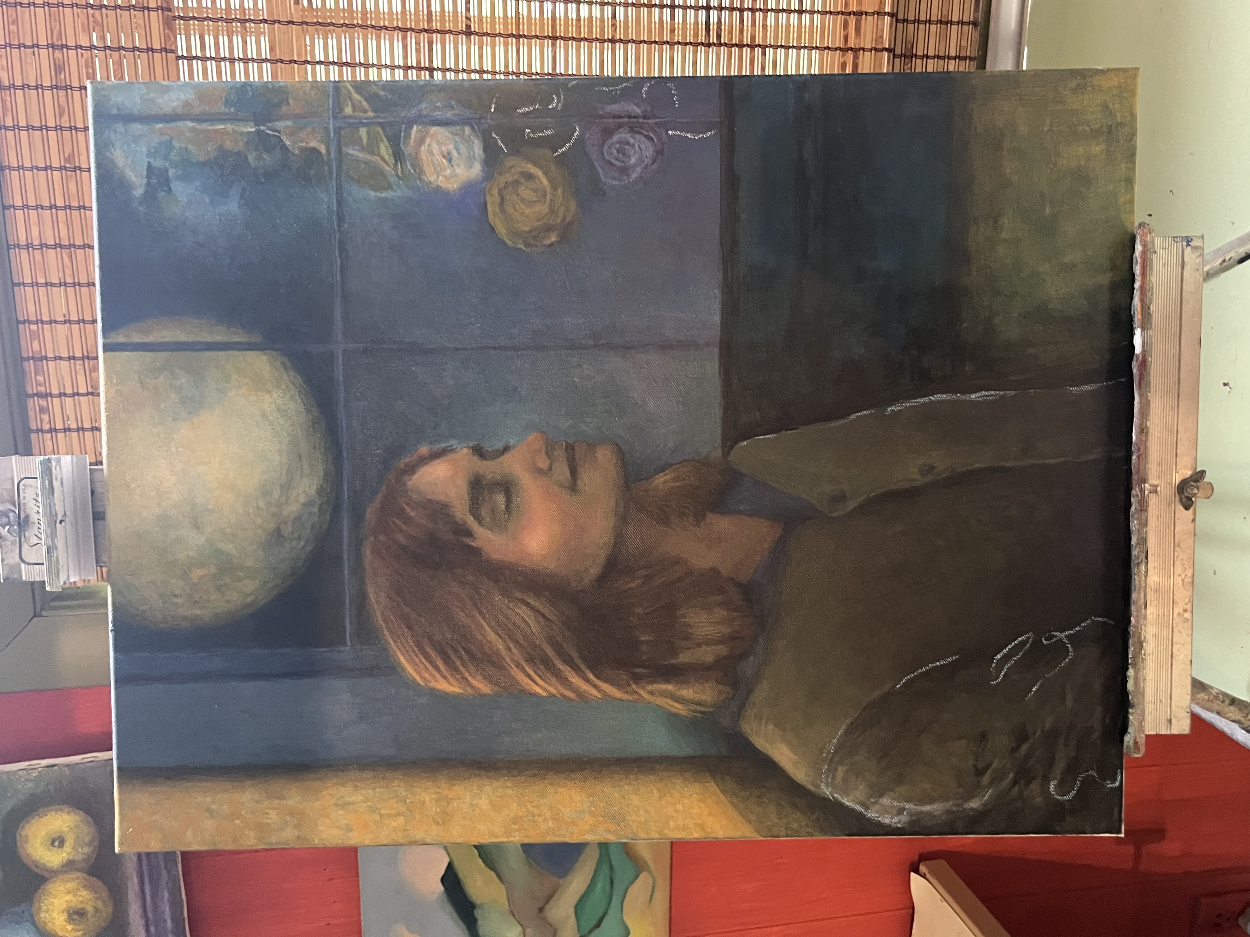
Here we see Caroline again, here standing beneath the moon like a flower in bloom. Both the roses to the right and the lining of her coat on the left have signs of a 'white chalk' outline to each. We could connect this white directly to the moon — 'Look at what it's drawing' — but each image is a wonderful invocation of a state of becoming. Tailors leave chalk outlines on clothes that are still being made, that still need the final cut. The roses follow a trail of chromatic descent. And the color! And how Caroline serves as the transition point for the color, holding both the warmth and coolness (four different shades of blue) within.
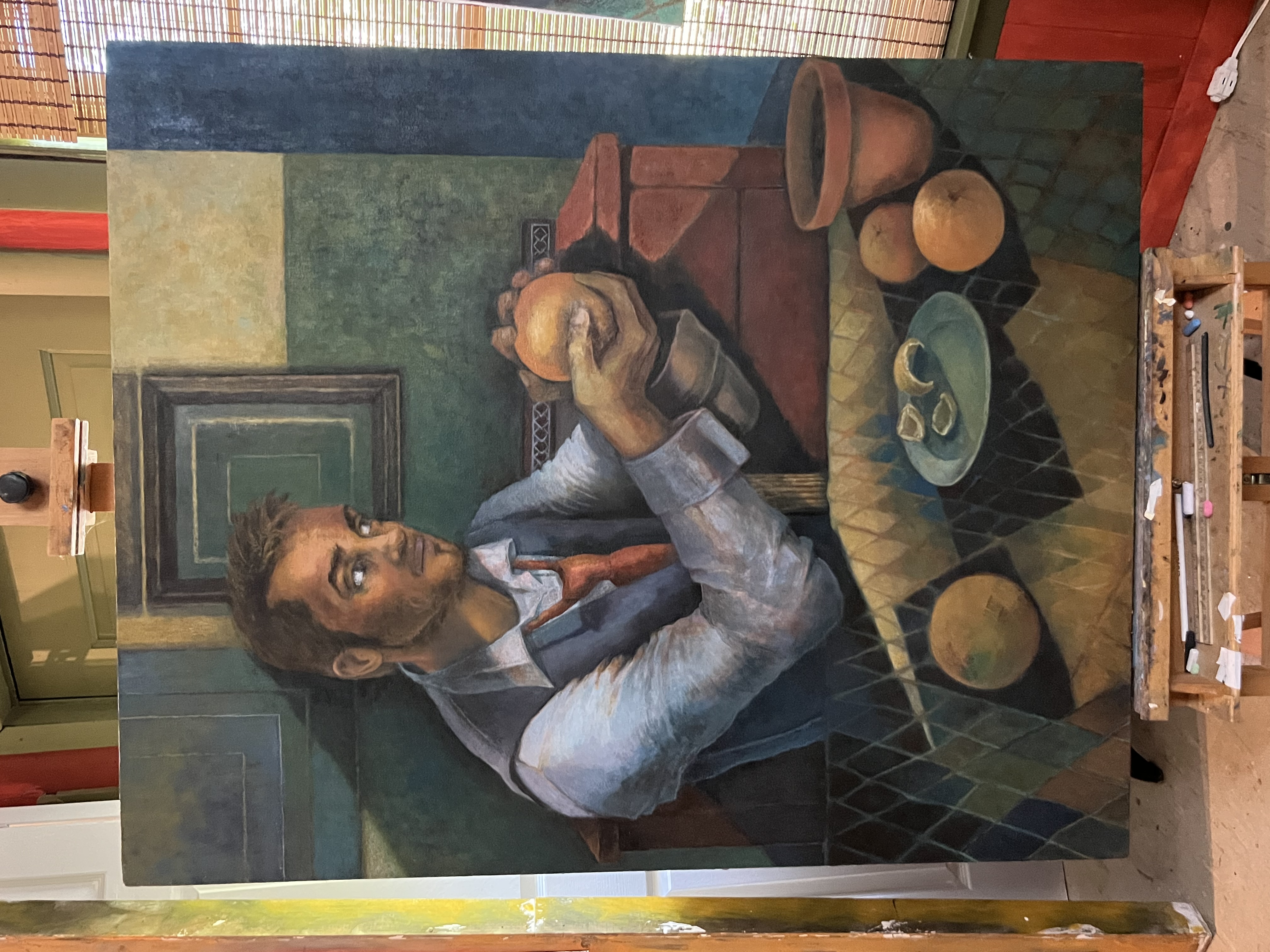
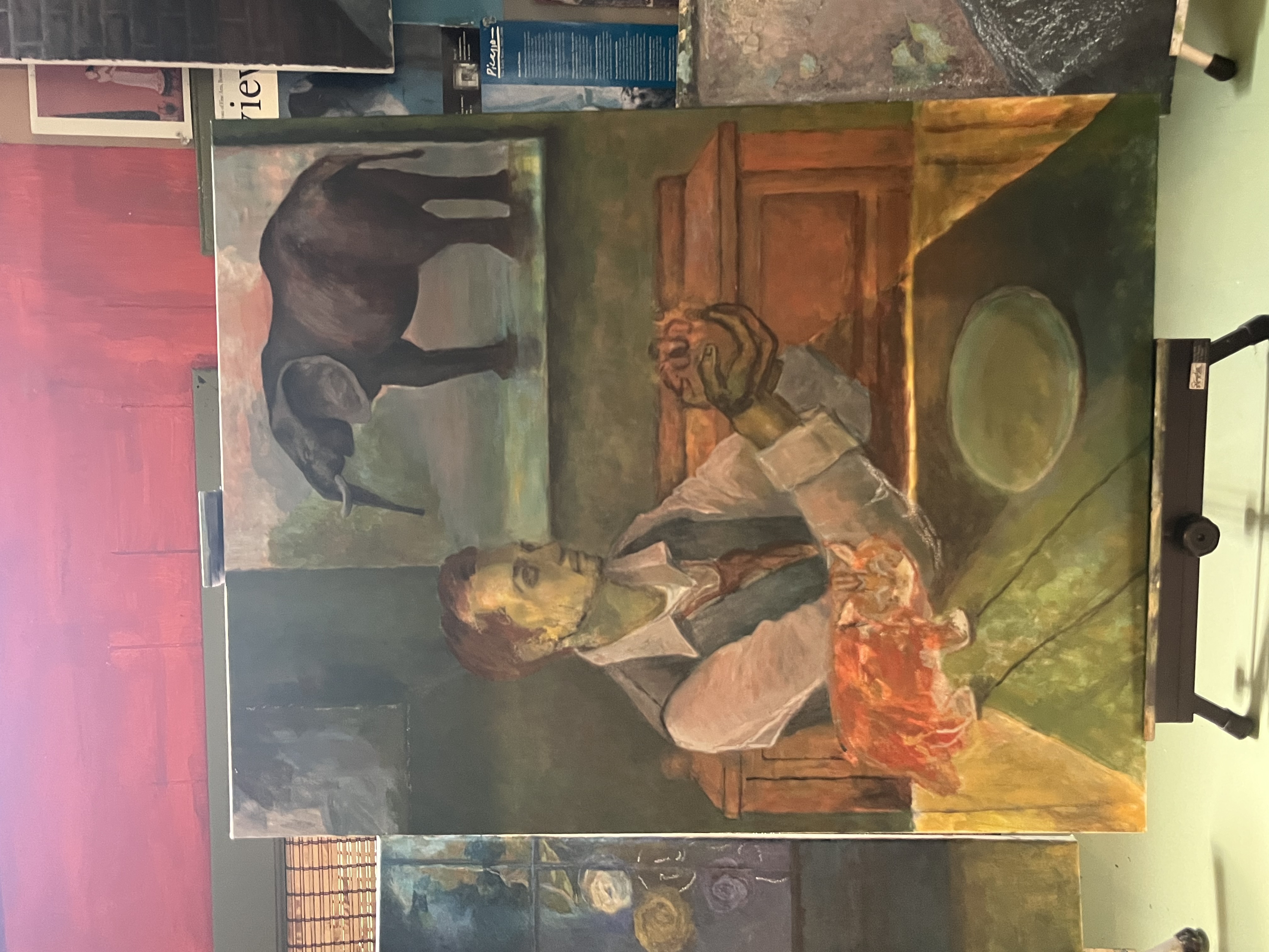
There are two paintings here in the studio of Evan, Kip's son, peeling an orange. One is finished; the other is Kip's final painting. As such, we are immediately invited to make comparisons: with the 'finished' piece, Evan's hands are bright. There is no elephant on the wall. There is no elemental orange cat forming on the table. The subject is younger than he appears in the other painting, such that we see his baby fat in his cheeks.
The subject and landscape in the 'finished' piece sit at the slightest of odds here: the figure does not belong to the landscape, which runs a little flat, a little bit at a cubist angle. The figure belongs to holding the orange, this brass ring of a fruit whereupon his eyes rest steady and locked.
The subject remembers when the painter asked him to sit for this. He sat. Despite being someone of incandescent energy, he sat still. His mother sat on the other side of the table. She sketched. She asked for a slight adjustment of the chin. He obliged. She asked him to hold the fruit in a few different ways. He obliged.
The color: there is so much orange here — on the face, on the table (in both the fruit of the terracotta vase), in the partial drawers positioned behind the subject. The yellow-gold of the upper right-most square even sees flecks of light begin to glow within the green above the subject's hands. The color suggests an argument of unified warmth — in both the subject's focus on the orange and in the painter's focus on the subject. A clean line of shadow moves behind him like he's a hero from a comic book.
In looking at Kip's final painting, we can see that the subject of the painting isn't too much older than when he was previously depicted. The shoulders are perhaps less defined in this later image. The baby fat has melted away. Hair loss has started to claim his scalp.
But there is the question of the hands, the elephant, and the cat. On the one hand, we can say that the orange cat resembles the subject's own cat, an orange Siberian named Bowie. We can talk about how the subject of the painting shared a quick sketch he had done of his cat resting on his couch on his iPad and showed it to the artist, his mother. We can not overlook the possibility therefore that — on one level — the cat could well be an intentional copy of her son's own work, in her son's own style — just as the painter perfectly copied an image the son had sketched of an astronaut inside an astronaut's helmet covered with blooming flowers.
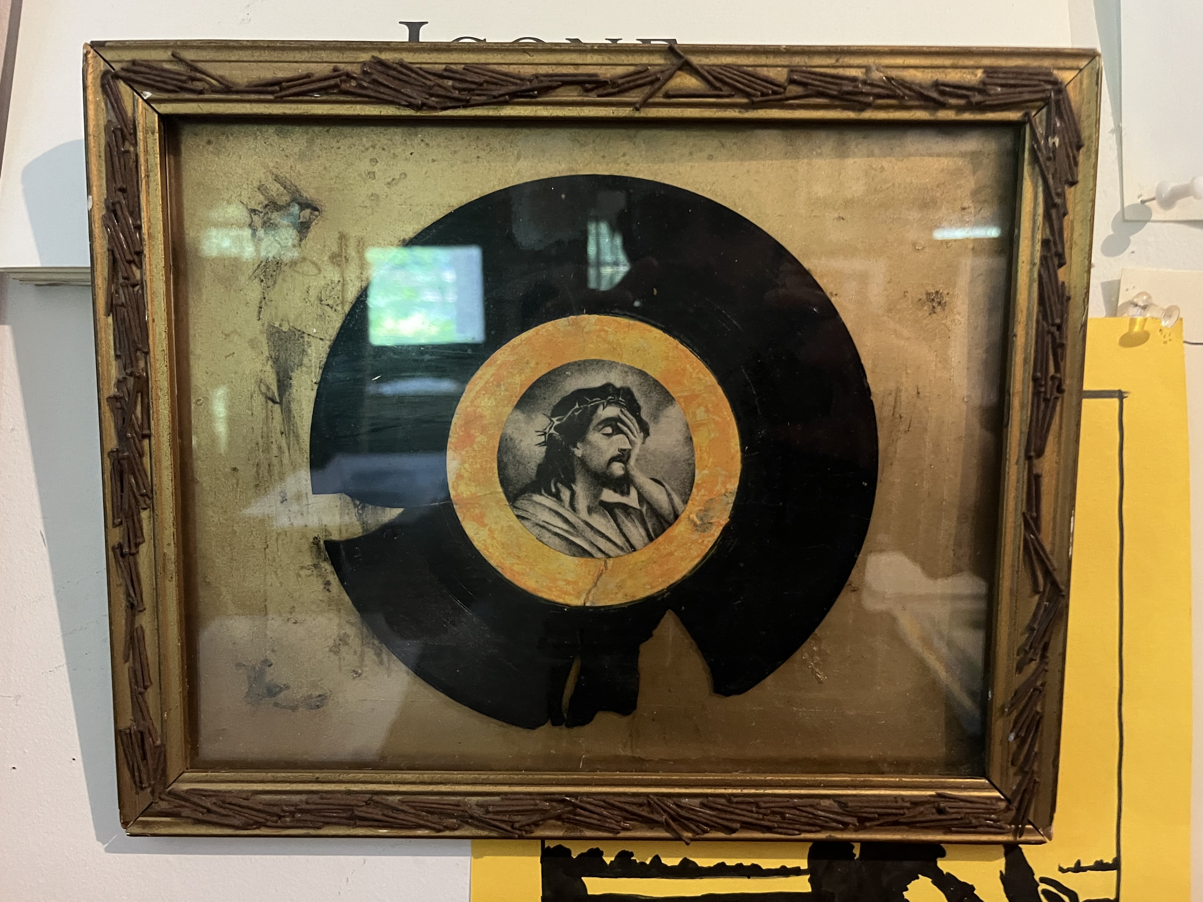
And what are we to make of Kip's exploration of religion? Or her Rauschenberg-like constructions? They're wry, yes, but look at the above (or her work that include a portrait of her with the caption 'Ah, men') in comparison with Mary Beth Edelson's Some Living American Women Artists (1972), which put the faces of living women artists over the faces of those (save Judas) at Da Vinci's Last Supper.
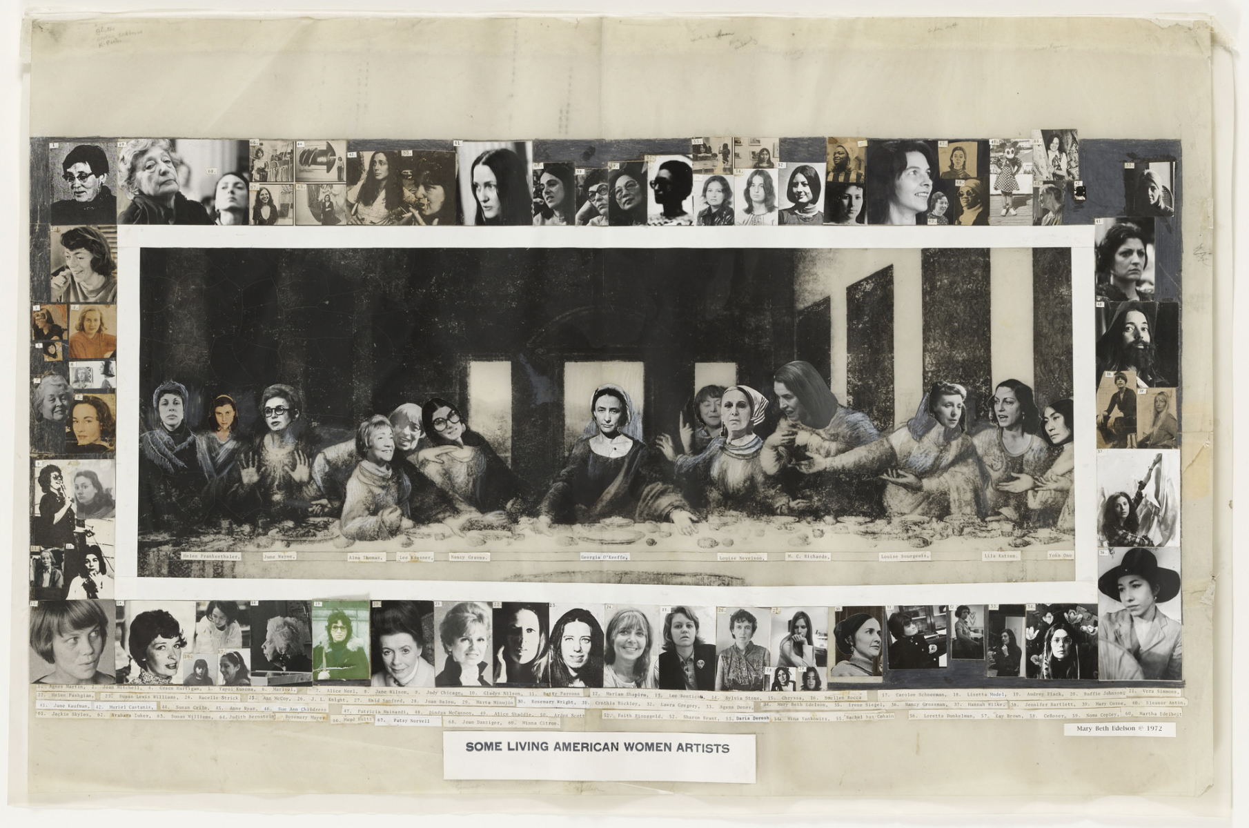
Who is religion for in these moments? Edelson seems to reasonably argue through her joking that religion is for everyone. Kip might not presume as overt a point, but she is there to look at the world and then turn back to you and say, 'Isn't that funny?'
Food and drink await you outside the studio. Thank you for coming.